Day 18: Mapping Cities: Visualizing TSP Evolution in .NET
- Chris Woodruff
- July 31, 2025
- Genetic Algorithms
- .NET, ai, C#, dotnet, genetic algorithms, programming
- 0 Comments
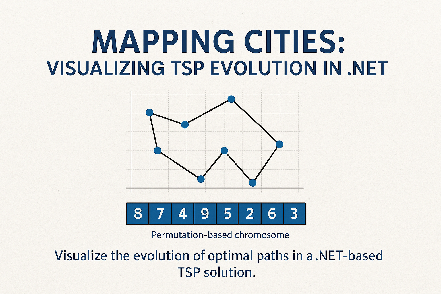
One of the most effective ways to understand the progress of a genetic algorithm is to visualize its evolution. When solving the Traveling Salesperson Problem, a well-designed visualization can clearly show how random routes evolve into efficient paths over time. In .NET, we can use simple drawing libraries like System.Drawing to generate visual output during the evolution process.
Today, we will walk through how to integrate a visual component into your genetic algorithm for TSP using permutation chromosomes. You will generate images that show the route taken by the best chromosome of each generation, allowing you to see improvement over time.
Start by defining city positions as a list of points. These positions will be used both to compute distances and to draw the city map.
public static PointF[] GenerateCities(int count, int width, int height)
{
    var rand = new Random();
    return Enumerable.Range(0, count)
                     .Select(_ => new PointF(rand.Next(width), rand.Next(height)))
                     .ToArray();
}
To calculate distances for fitness evaluation, use the Euclidean formula:
public static double[,] ComputeDistanceMatrix(PointF[] cities)
{
    int n = cities.Length;
    var matrix = new double[n, n];

    for (int i = 0; i < n; i++)
    {
        for (int j = 0; j < n; j++)
        {
            var dx = cities[i].X - cities[j].X;
            var dy = cities[i].Y - cities[j].Y;
            matrix[i, j] = Math.Sqrt(dx * dx + dy * dy);
        }
    }

    return matrix;
}
To visualize the best route of a generation, use System.Drawing to render the cities and draw lines connecting them in order.
public static void DrawRoute(string filename, PointF[] cities, int[] route)
{
    int width = 800;
    int height = 800;

    using var bmp = new Bitmap(width, height);
    using var g = Graphics.FromImage(bmp);
    g.Clear(Color.White);
    var pen = new Pen(Color.Blue, 2);
    var cityBrush = Brushes.Red;

    // Draw cities
    foreach (var city in cities)
    {
        g.FillEllipse(cityBrush, city.X - 4, city.Y - 4, 8, 8);
    }

    // Draw route
    for (int i = 0; i < route.Length - 1; i++)
    {
        var a = cities[route[i]];
        var b = cities[route[i + 1]];
        g.DrawLine(pen, a, b);
    }

    // Close the loop
    g.DrawLine(pen, cities[route[^1]], cities[route[0]]);

    bmp.Save(filename);
}
Integrate this into your genetic algorithm loop so that it saves a frame every N generations. This provides a sequence of images that shows the optimization in action.
if (generation % 10 == 0)
{
    var best = population.OrderByDescending(c => c.FitnessScore).First();
    DrawRoute($"output/gen_{generation}.png", cities, best.Genes);
}
Ensure the output folder exists before saving the frames.
The result is not just a working genetic algorithm, but a visual insight into how it thinks. You will be able to observe how early generations explore random routes and how selection, crossover, and mutation push the population toward more efficient paths. Over time, city connections become tighter and smoother as the algorithm converges.
This feedback loop is not only educational, but it is also helpful in debugging and tuning. Visual artifacts can reveal stagnation, lack of diversity, or local optima. If progress stalls or routes oscillate without improvement, it may signal a need to adjust mutation rate, crossover strategy, or selection pressure.
Visualization bridges the gap between algorithm and understanding. It transforms the abstract concept of evolution into something tangible and clear. For problems like TSP that exist in a spatial domain, there is no better way to validate your GA than watching its path to success unfold on a map.
Related Posts